
Events can be a sensory overload! Planting your message right into the middle of everyone’s favourite screen – their phone – is a measurable way to capture people’s attention and turn an in-person interaction into an online relationship.
As well as giving event sponsors a way to automatically reach their audience and increase brand recognition, a splash page can be part of a robust WiFi marketing strategy to collect data, run offers, re-market to audiences after an event or even better plan for future events.
2019 saw our partner brands and businesses using this valuable real estate in such clever ways that we decided to collect some of the most effective designs and put together a quick rundown of what made them work so well…
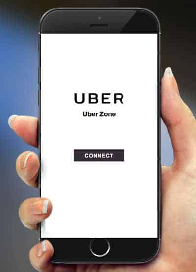 1) They kept their splash page simple.
If brand recognition is top of mind, follow the minimalist strategy. Uber kept lots of space around their logo and used a straightforward Connect button. It kept the attention on the Uber logo and made sure people knew who to thank for making it easy to hail a ride home from the packed football grand final.
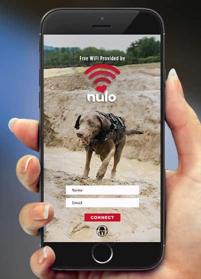 2) A background image that links to the event theme.
Nulo Petfood’s activation took place at Spartan Races. We loved the way their hardworking doggo picture perfectly reflected the essential “muddy contestant” pictures that are the hallmark of the famous obstacle course.
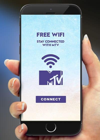 3) A little wordplay goes a long way.
MTV kept their text minimal, but lightly riffed on the idea of “Connect with MTV”, with the WiFi symbol and MTV logo working together. The attendee was invited to “Connect”, then was automatically directed to an MTV landing page that invited them to connect with MTV via social media. Nice.
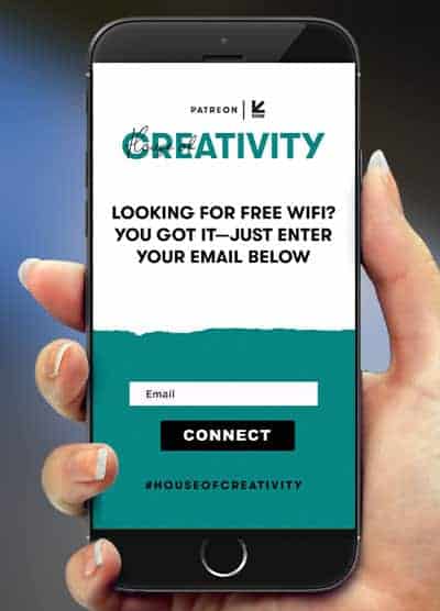 4) Stay style-conscious.
Patreon showed us just how important it is to remember to think of the context in which the splash page is going to be seen. Their immersive House Of Creativity activation at SXSW this year was a study in cohesion, with their fresh aesthetic flowing all the way from the decor to the guest’s own phone screens.
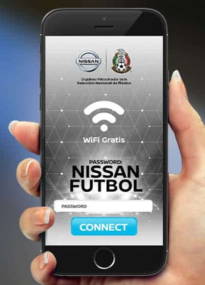 5) They gave their audience the tip.
Just in case people missed the branded signs in the heaving stadium, the Mexican Football Association added a password on the splash screen to make fans pause and notice that the WiFi was supplied by Nissan. Genius!
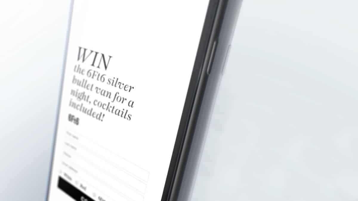
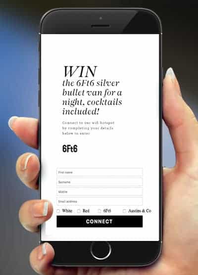 6) They made attendees an offer they couldn’t refuse.
6Ft6 offered guests the chance to win a shedload of cocktails in exchange for supplying their details via the event splash page. Not only could they then use the email addresses for future marketing campaigns, it also motivated guests to enter an accurate email address when connecting.
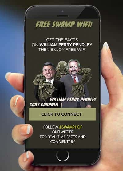 7) They kept the information relevant.
The Swamp gang used their splash page to share some event info and promote their Twitter handle to not only increase awareness but add to guest’s experience with real-time commentary. Feel the love.
 8) They threw in a bonus question.
For this community event, the organisers wanted to know which businesses were represented so they added a “Business Name” field to gather data along with email addresses to build a picture for reporting. We love the way that they chose just two fields for their form to keep it quick and easy to connect.
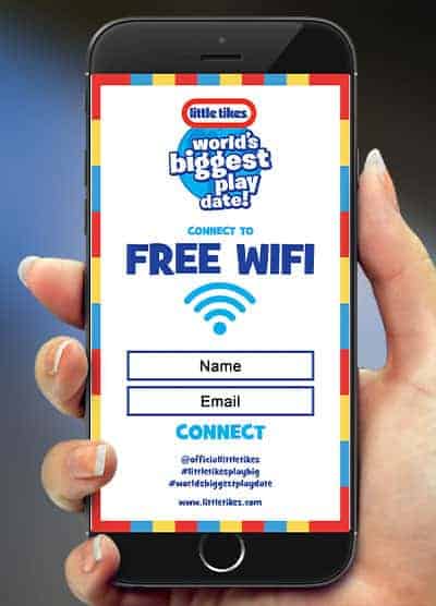 9) They kept it fun!
To keep with their event’s giant celebration theme, Little Tikes brought their sense of fun from their World’s Biggest Play Date into their splash page with this colourful design.
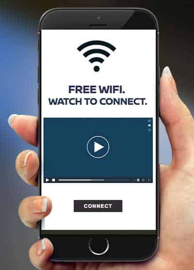 10) They added 7 seconds of video.
Take your splash page to the next level by adding a GIF or video for maximum engagement. This splash page asks people to view a short video before connecting. Remember to keep it short (7 seconds max) and add captions as events are noisy places.
And if you’re wondering what that all means to your sponsors and clients, consider the main takeaways that all our featured splash pages had in common:
1. Their splash pages were part of a well-thought-out WiFi marketing strategy.
The brands in the list weighed up their priorities and designed their splash pages with their ultimate outcomes in mind. Sometimes that meant having to forgo using some tempting features to achieve the overall goal, whether that was mass hits on a landing page, responses to a survey or gathering email addresses. The brands were clear about what the goals of the activation were – during the event and afterwards – and designed around this.
2. They provided WiFi as a pro data-capture move and as a genuine gesture of hospitality.
The brands were realistic about what the users were likely to be doing or feeling at the time they were connecting to the WiFi. If people are gradually showing up to an event like a conference, they likely have time to answer a few questions. If guests are in the middle of a packed crowd at the football and cellular service is failing, they are likely to feel more positive towards a brand that keeps it simple just helps them to get online and stay in contact.
3. The designs worked within the live activation or event.
The brands made sure the colours and messaging worked within the broader activation and event context and considered carefully who the users might be.
4. They followed the 7-second rule.
The designs could be viewed and read within 7 seconds. It can be tempting to add extra text and imagery but less is more with splash-pages.
5. Their brands were loud and proud.
This is no time for modesty! Splash pages are a definite moment that the user is concentrating on their screen. Our brands all made sure their logo and call to action featured proudly in the user experience.
So here’s to splash pages and the people who designed them into their experiential marketing campaigns in 2019. We predict that 2020 will see more brands keen to turn an in-person interaction into an online relationship long after the event. If you’re thinking of integrating WiFi marketing into your practice, drop us a line.